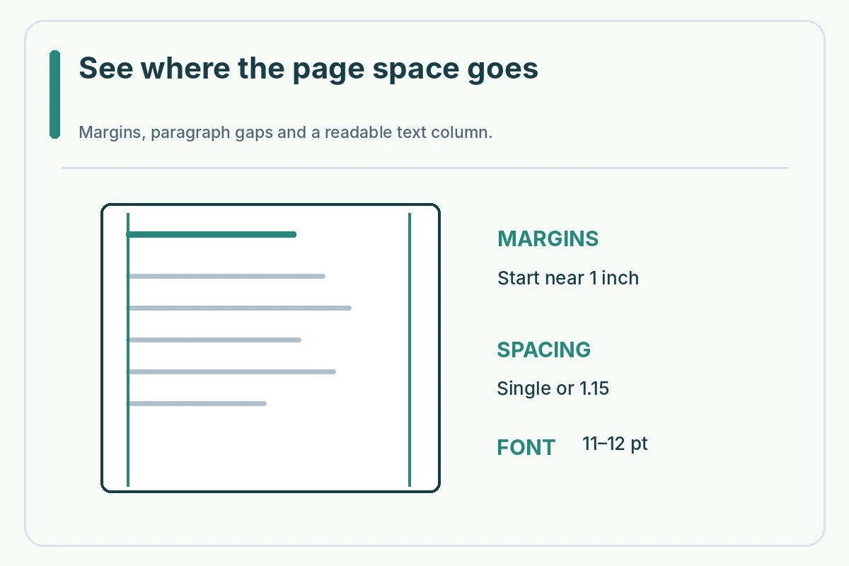
For a US cover letter, start with a readable font, ordinary margins, left alignment and distinct paragraphs. One-inch margins and single or 1.15 line spacing are common starting points, not requirements that override a job posting. If your letter runs to a second page, first cut irrelevant sentences instead of reducing text until it is uncomfortable to read.
A cover letter is a short argument for your fit, not a complete second resume. Spacing should make the role, your evidence and the closing easy to find. The precise line count depends on the words, font, heading and application channel. The sample settings below are a starting configuration, not a guarantee that the document will fit or be read.
Start with a stable page setup
Open a blank US Letter document or a simple cover letter template. Set margins around one inch, make body text approximately 11 or 12 points in a legible face and align paragraphs to the left. Microsoft provides those settings as practical defaults. If your employer requires a different format, follow the posted instruction rather than silently replacing it.
Keep the same body font throughout the letter. Varying several fonts or squeezing line height can make a letter harder to scan, even when it technically stays on one page. A matching resume header is helpful when it is not oversized. Check whether the header creates an unexpected second-page break after you add the recipient, date and signature.
Make paragraph spacing deliberate
Use single or 1.15 line spacing and visible separation between the greeting, opening, evidence paragraphs and closing. You can add modest space after paragraphs or a blank line; avoid combining several empty paragraphs with excessive spacing settings, because that produces unexplained gaps. The exact amount is a matter of readability, not a hidden applicant-tracking rule.
Imagine a hypothetical letter with a dense ten-line middle paragraph. Split that into two shorter units only if each makes a different point: perhaps task evidence in one and employer relevance in another. Do not create a one-line paragraph every time a sentence changes subject. The reader should see a purposeful beginning, proof and closing without reading a decorative template as a chart.
Fix a two-page letter in the right order
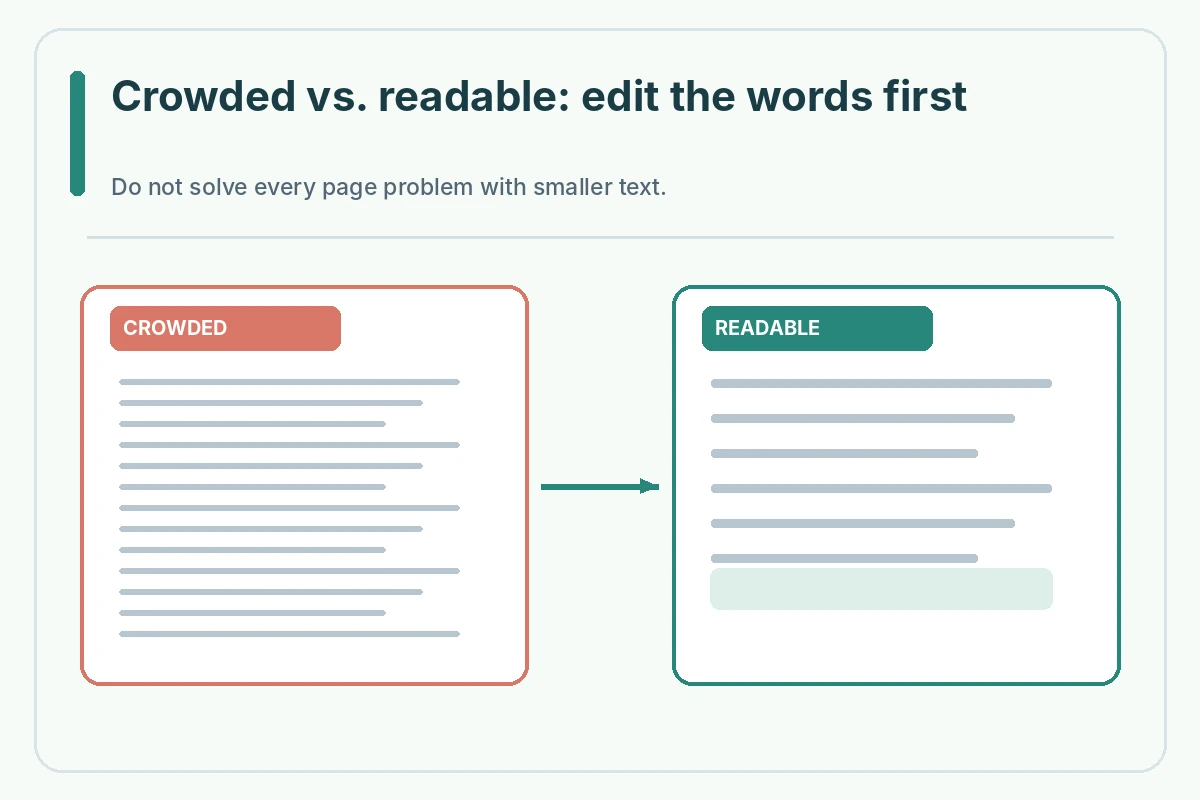
Before modifying the page margins, remove repeating claims such as “hard-working,” sentences that only announce you are applying, and details already obvious from the resume. Keep the one example that proves an important requirement. Then shorten your greeting and closing if they are wordy. This usually preserves more reading comfort than shrinking every line.
Only after editing content should you inspect empty paragraphs, paragraph spacing, header height and page-break settings. A final layout adjustment can be reasonable, but do not chase a rigid one-page rule by making important text unreadable. University career centers usually suggest a concise one-page format; an employer-specified longer statement is a different task.
Compare crowded and readable examples
Hypothetical crowded layout: eight-point body type, half-inch margins, five sentences about general enthusiasm and a paragraph crammed with six unrelated skills. A better version keeps a readable type size and replaces broad claims with one concise example: “I coordinated a weekly volunteer roster and confirmed changes with the event lead.” That is illustrative, not a job result you may claim.
Read the revised letter at 100% zoom, then as a fit-to-page preview. The smaller view reveals uneven whitespace; the 100% view reveals whether type is comfortable. Check that the contact header, date, greeting, evidence and closing still fit naturally. A clean page cannot compensate for an example that does not match your actual experience.
Check headers and hanging lines
Look for a heading isolated on the previous page, a signature separated from the closing or a single line pushed onto page two. These are layout problems, not a reason to remove essential employer instructions. Change paragraph spacing and keep-with-next behavior carefully, then inspect the final output.
Avoid putting contact details inside floating shapes or columns that could move when the file is converted. For a straightforward cover letter, a text-only header is usually easier to maintain. If you copy the header from the resume, review it after pasting because different styles may bring large hidden spacing values.
Export and review the actual submission file
If the posting permits a PDF, export the finished document and open that PDF—not just the editable Word file. Check margins, readable text, paragraph breaks, special symbols, hyperlinks and the complete closing. If the portal requires a Word file, check the DOCX itself on another screen if possible.
Do not trust a file preview that hides the final line, and do not assume the upload system preserves every style. If a form asks for plain text, a different format is needed and margins no longer apply. Keep the original editable file so you can adjust the letter for another role without overwriting the version already submitted.

When matching a resume, match the basics
Use the same personal name spelling, accurate contact information, and compatible font treatment on both documents. UC Berkeley recommends consistent presentation. This does not mean duplicating decorative resume graphics or forcing every header to be exactly the same height. A consistent, legible look is enough.
A simple final checklist is: readable at full size, no unexpected second page, intentional paragraph breaks, correct employer and role, complete signature, and file type allowed by the posting. If one check fails, fix the underlying problem and export again. Do not treat a layout checklist as proof that an ATS or recruiter will accept the application.
Worked Example: A Draft You Must Personalize
Hypothetical editing example: a cover letter spills onto page two because the candidate used a four-line header, two redundant introduction sentences, and an oversized closing. The candidate removes repetition, reduces extra paragraph spacing, and keeps an 11-point font. The important volunteer coordination example remains intact. This describes a possible editing sequence, not a measured hiring improvement.
Treat this example as a demonstration only. Do not copy fictional employment, names, credentials, results or contact information into a real application. Recheck each detail against your records and the employer posting. When a system does not show a submission receipt, do not claim that a saved document was delivered.
Verify This Letter in Its Actual Submission Format
Before sending, reread the headline question: cover letter margins and spacing. Verify that the visible letter matches the employer and role, the claims describe things you actually did, the document or text is readable in the target channel, and no sample placeholders remain. A practical check has four steps: compare the posting, open the exact submission file, inspect its content or preview, and record the actual submitted status. Do not treat this guide as a promise of a recruiter response.
When you adapt the letter for another employer, repeat the check from the beginning. Employer-specific instructions outrank generic examples, and digital portals may behave differently. A clear application is valuable because it communicates your experience faithfully, not because a particular font, file name, software or page layout is universally approved.
How We Research This Guide
We compared first-party career-center cover-letter guidance, Microsoft Word documentation where relevant, and the JobAsk topic inventory on November 2, 2026. The guidance describes practical formatting options rather than mandatory US-wide hiring rules; real job postings and submission platforms take priority. Examples and names are fictional, not verified candidate outcomes. Read our affiliate disclosure.
Microsoft Word layout guide: Microsoft explains readable type sizes, page margins, spacing, templates and export checks in Word. Reviewed November 2, 2026.
Career guidance source: Dartmouth career center explains letter layout, spacing and recipient blocks. Reviewed November 2, 2026.
Career guidance source: UC Berkeley advises aligning cover-letter font, contact header and layout with a resume. Reviewed November 2, 2026.
Career guidance source: CareerOneStop describes the purpose and usual sections of a concise, tailored cover letter. Reviewed November 2, 2026.
More Resume and Cover Letter Guides
No. They are a common readable default. Follow the application instructions first and keep the final document legible.
Either can work. Use consistent spacing with clear paragraph separation and inspect the exported file.
Edit redundancy and irrelevant content before changing font size or margins. Inspect the header and closing for hidden gaps.
A simple one-column business-letter layout is easier to read and convert. Use columns only when the application clearly supports them.
No. A text box uses the portal layout; focus on plain-text paragraph separation and its word or character limit.