Use bold on a resume to help readers find the name, section headings and perhaps job titles. Keep ordinary achievement bullets in regular text. Italics can distinguish a publication title or a limited secondary detail, but they should not carry essential information by themselves. Underlining is rarely needed; on a digital resume it may look like a link. The practical test is simple: a reader should find the latest employer, role and dates without studying a pattern of competing fonts.
Decide what a reader needs to find first
A typical recruiter scans for identity, relevant qualifications, recent employment, work dates and evidence of contribution. Use a visual hierarchy that supports those tasks. Your name can be largest; section headings should repeat one consistent style; role titles can be bold; employer names and dates should remain easy to locate. Do not bold entire paragraphs of achievements, because broad emphasis makes every phrase compete for attention.
For example, a hypothetical entry might read “Operations Analyst” in bold, “Example Services” in normal text, and “2023–Present” aligned consistently. The first bullet then explains a verified task, such as checking order records against a controlled report before a supervisor reviewed exceptions. The visual emphasis directs attention but never invents performance metrics or changes the ownership of the work. Every date and title remains real text.

Use bold consistently across repeated entry types
If the first role title is bold, use the same treatment for all comparable roles. If employers are bold instead, keep that rule throughout the resume. Inconsistency can make an ordinary job entry appear to be a new section or imply that one employer is more important for no reason. Make the decision once in the base style, not independently for each entry as you write it.
Avoid using bold as a substitute for proof. A phrase such as “EXCEPTIONAL LEADER” does not become credible because it is set in heavy capitals. Evidence is stronger: describe which meetings you facilitated, what documentation you created and who approved the final decision. Use emphasis on the information category, not on an unsupported superlative. USC’s formatting guidance stresses clarity and consistent choices.
Limit italics to secondary details that remain legible
Italics may help with a scholarly publication title, a short distinction beneath a heading, or a role descriptor, but long italic paragraphs are harder to scan. If a skills or credentials section contains important details, use regular text with an explicit label. Never make the legal status of a certification depend solely on italics or gray color. “In progress” needs to be written as words next to the item.
Consider a graduate applying to a research coordinator role. The title of a paper can be italicized as a conventional typographic choice while the author list, venue and date remain clear. A project description should still use straightforward, readable sentences. A commercial or administrative resume may not need italics at all. More styles do not create more qualifications, and the employer’s requested template may restrict formatting.

Use underlining carefully around URLs and headings
Underlining often resembles hyperlinks in a PDF, so use it sparingly for non-link text. If your portfolio URL is clickable, make sure its visible text identifies the destination; do not underline every job title and section heading. A short horizontal rule might divide sections visually, but it should never replace the heading label. Readers who print the resume need the same information hierarchy as those viewing it on a screen.
If you choose to underline a heading, apply the same style to parallel headings and check the baseline for descenders such as g or y. A simple bold heading without underline is often easier to maintain. In Word, a line can also be a paragraph border rather than a string of underscore characters. Test after export because decorative rules can shift position when the document wraps or fonts substitute.
| Situation | Action | Check |
|---|---|---|
| Candidate name | Largest, clearly readable text | Easy to identify |
| Section label | Consistent bold heading | Easy to navigate |
| Job title / employer | Choose one predictable bold pattern | Dates stay connected |
| Achievement bullet | Regular text with specific verb | Evidence does the work |
Check contrast, size, and the PDF at actual scale
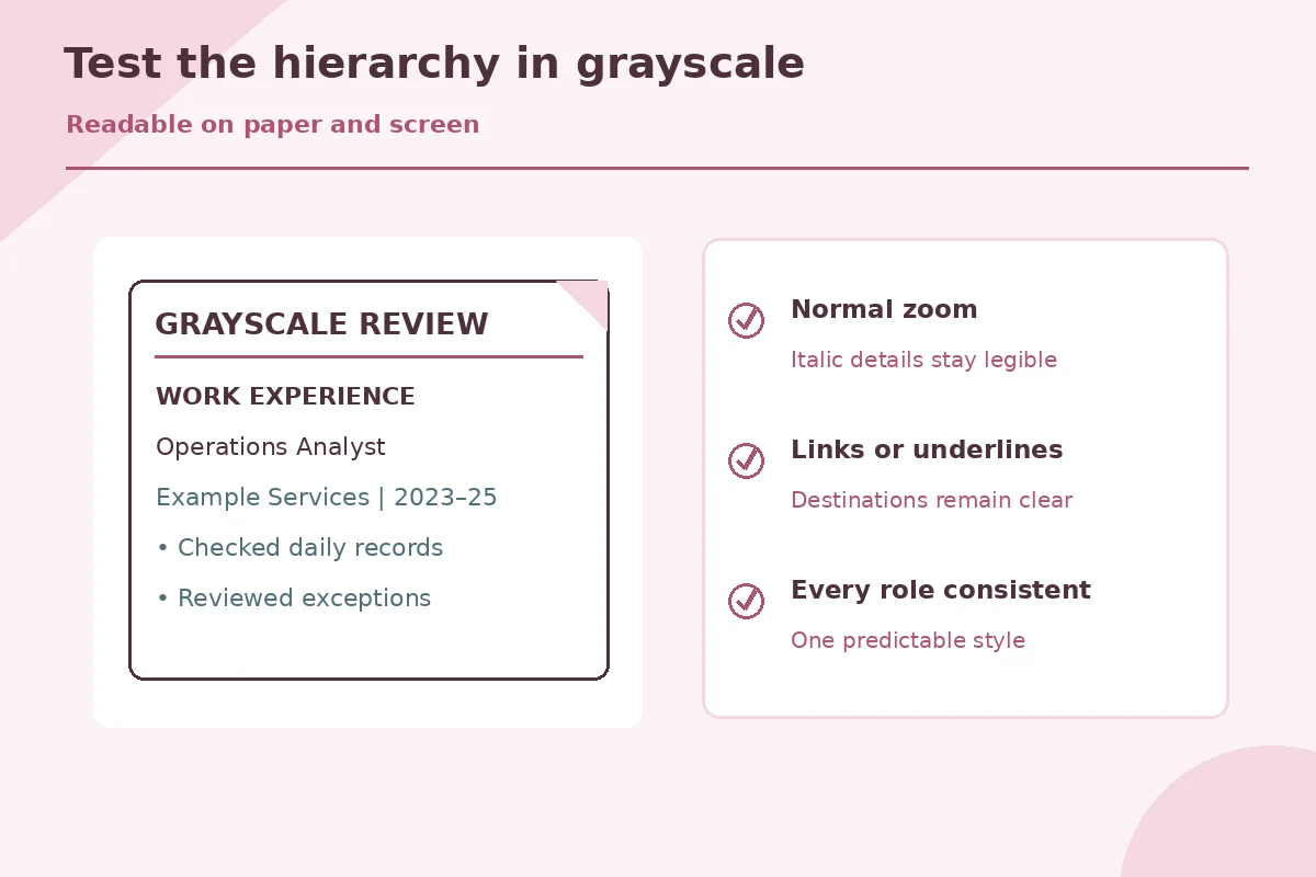
A pale gray italic caption may look elegant on a bright editing monitor but disappear when printed or viewed small. Use dark, readable text, sufficient font size and strong contrast. Microsoft’s accessibility guidance says color should not be the only way to convey meaning. UC Davis recommends clear headings and readable fonts in an ordinary resume layout. Your emphasis system should still work if the resume is printed in grayscale.
Export the PDF and inspect it at a normal zoom, not only at 200 percent. Verify that thin italic strokes, dates, link text and short bullets remain visible. If a role title wraps awkwardly, change phrasing or spacing before reducing all text size. A consistent hierarchy can accommodate different work histories; it should not require every candidate to use an identical font or a single page.
Run a simple emphasis audit before applying
First cover the achievement bullets and look at the page. Can you find each role and employer? Next read only the bullets: are claims specific and independently intelligible without bold keywords? Finally look at the exported file in black and white and confirm nothing important vanishes. Remove heavy ALL CAPS emphasis, multiple typefaces and repeated underlines that add visual noise without helping navigation.
If your resume must go into a portal that strips formatting, remember that the words need to stand on their own. Job title, dates, qualification names and results should be clear even as plain text. For a federal application, use the current USAJOBS formatting guidance and job announcement rather than assuming a styled design meets agency expectations. A restrained format supports evidence; it is not a screening shortcut.
How We Research Resume Layout and Export Requirements
We reviewed these primary university, government, and software documentation sources on November 7, 2026. Guidance varies across job sectors, and federal application rules have changed; always read the current employer announcement. The resume examples here are hypothetical and are not actual candidate records. careers.usc.edu (USC recommends minimal, easy-to-read resume formatting and consistent style choices.) careercenter.ucdavis.edu (UC Davis recommends legible fonts, clear headings and concise bullets.) support.microsoft.com (Microsoft says accessible text needs sufficient contrast and should not rely on color alone for meaning.) help.usajobs.gov (USAJOBS recommends ordinary sans-serif fonts and readable sizes for federal resumes.)
These guides are informational and carry no paid template rankings or verified software partnerships. Read the site affiliate disclosure for how any commercial relationship would be identified. No layout technique guarantees screening results or an interview invitation.
More Resume and Cover Letter Guides
That is a sensible option. Choose whether titles or employers receive the main emphasis and apply the rule consistently.
Use sparingly. Long italic passages are harder to scan; keep substantive bullet points in regular text.
Usually it is unnecessary. Clear bold headings and spacing often communicate the same structure more cleanly.
Do not assume formatting changes improve an ATS score. Clear, truthful qualifications and employer-specific content matter more.
Follow the employer instructions. Pick a legible font and size and check the actual exported file, including grayscale readability.