Use a consistent name-and-contact header across your resume and cover letter without creating unreadable graphics, oversized logos, or conflicting contact details. This guide explains what to change for this specific format, shows hypothetical examples rather than real applicant outcomes, and separates ordinary editorial advice from any employer-specific requirements. Use the latest official announcement before submitting.
Start with identity consistency rather than decoration
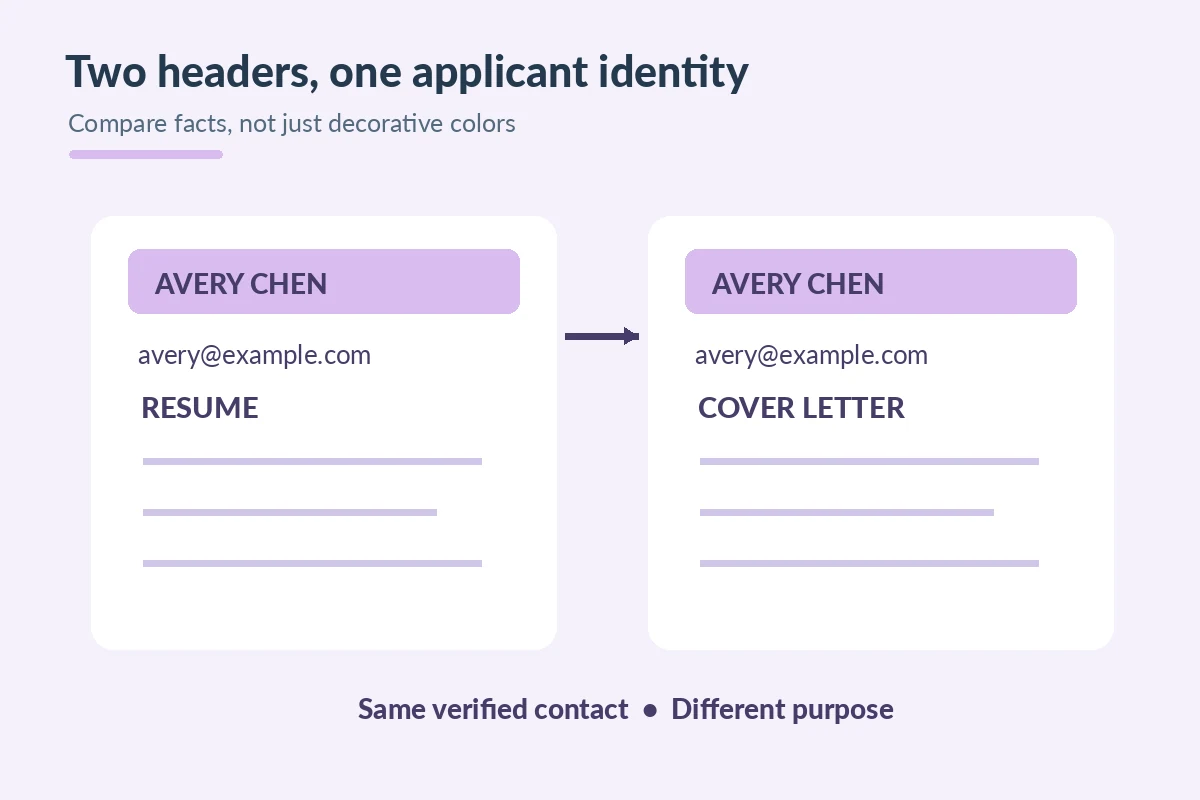
A cover letter letterhead is the name-and-contact area at the top of the page. Its job is to tell the reader who submitted the document and how to reach them. Matching it to your resume can make two files feel like one application, but a matching design is less important than matching facts. Compare spelling of your name, email address, phone number, and any professional link. If you use a different preferred name on one document, explain it consistently rather than hoping the hiring system will connect two identities automatically.
A simple shared design could use your name in a larger readable type size and a single line with email and phone beneath it. Avoid a giant emblem that consumes space needed for the role-specific letter. Do not imitate the employer’s logo or imply that your letter was issued on its official stationery. A personal letterhead is not a corporate endorsement. If a template includes sample contact details or decorative icons, replace or remove them. The strongest matching signal is accurate identification, not a color palette that might not survive printing.
Decide what contact details belong on both pages
Keep a reliable email and reachable phone number that you will monitor during the application period. A city or region can help for roles with an on-site or hybrid requirement, but a full street address is not automatically necessary for a modern online submission. Use a professional portfolio URL or profile link only if relevant and publicly viewable. If your resume lists a portfolio, the letterhead should not point to an outdated or restricted version of the same work. Open the links while logged out when that is safe and possible.
An illustrative pair might show “Avery Chen | avery@example.com | Denver, CO” on both documents. These are fictional identifiers. If one document also carries a role-specific headline, do not blindly copy it into the other: a resume headline may describe your qualifications, while the cover letter can identify the opening in the first paragraph. Keep sensitive information off both headers, including identification numbers, birth date, private client details and unnecessary home address information. A header is not an identity-verification form.
Use a clear hierarchy and preserve readable text
A consistent header might repeat a font family and one restrained accent color, but it should remain legible in black and white. Choose enough contrast between the text and page. Keep the actual words as selectable text rather than flattening the name, email and phone into a decorative image. Microsoft’s accessibility guidance warns that essential information in document headers or footers can be missed by assistive tools; for a short letter, place important contact information in the main document flow when possible and confirm its reading order after export.
Avoid complex tables, layered shapes or two-column layouts just to imitate a graphic design template. They may look polished to a sighted reviewer yet be harder to read aloud or reflow. If you do use an icon beside an email address, the email text must still be visible and self-explanatory without the icon. The appearance can be distinctive without competing with the evidence paragraphs. A recipient should be able to locate the name, the role, and the key experience after a quick glance at a small screen.
Make the header match across file revisions
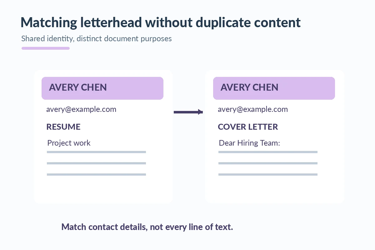
Small mismatches often arise when an applicant updates the resume but reuses an older cover-letter file. Perhaps one version lists an old phone number, one uses a university email account that expires, or one links to a portfolio with restricted access. Before each application, place both files next to each other and compare exact contact strings. Check the filename and the date separately; a matching header cannot repair a letter still addressed to another employer.
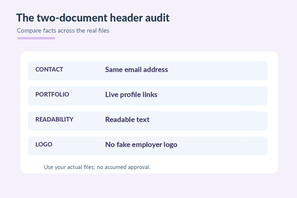
An effective comparison grid has rows for displayed name, contact number, email, location when relevant, and portfolio link. Mark mismatches only after reviewing the underlying facts. Some differences are intentional: a resume might include an extensive project link, while a short cover letter lists only your email and name. Consistency means no contradiction, not that every visual element must be identical. Do not add unnecessary personal information merely to fill all the spaces in a decorative letterhead template.
| Element or channel | Specific check |
|---|---|
| Identity | Name and professional contact paths agree. |
| Design | Repeated font and restrained accent, not a giant logo. |
| Accessibility | Critical details are selectable and readable. |
| Version check | Both files identify the same applicant and current links. |
Export and review the exact paired documents
Once the header is stable, save the documents in the file types the employer accepts. If sending PDF copies, run your editor’s accessibility check and confirm the saved file retains selectable text and functional links. Microsoft documents options for producing tagged PDFs from Word, but you still need to inspect the export. Test the contact line at ordinary viewing size and on a phone-sized screen. Make sure the font did not substitute, the first paragraph did not wrap beneath a logo, and neither file contains tracked changes.
A letterhead can help keep a set of documents organized for the reader, yet it is never evidence of a hiring advantage or an ATS acceptance guarantee. The relevant message remains your verified match to the job. Apply a practical standard: the documents use the same identity, both open correctly, and the letter still spends more space on evidence than branding. If the employer supplies a plain-text form instead of file uploads, preserve the contact facts and omit the decorative header. Follow the application format rather than forcing stationery into every channel.
How We Research Cover Letter Formats
We reviewed official career guidance and document-accessibility resources for the specific presentation and channel questions in this article: CareerOneStop. Microsoft Support. Microsoft Support. The examples use fictional applicants, posting codes, and organizations; they are not employer policies, application receipts, testimonials, or promises that software will accept a document. Where an employer specifies a different field, signature, length, or file format, the actual announcement controls. See our affiliate disclosure; these informational links carry no invented affiliate relationship.
More Resume and Cover Letter Guides
They may share a readable style, but clarity and correct contact details matter more than an exact decorative match.
Only if it is relevant, unobtrusive and does not imply employer endorsement or replace readable contact text.
Not automatically. Include location or mailing details when relevant or requested.
Prefer selectable text so the information can be read, copied and navigated by more readers.
They should not contradict each other. Include only relevant, current links and test their access.